Exhibition Labelling
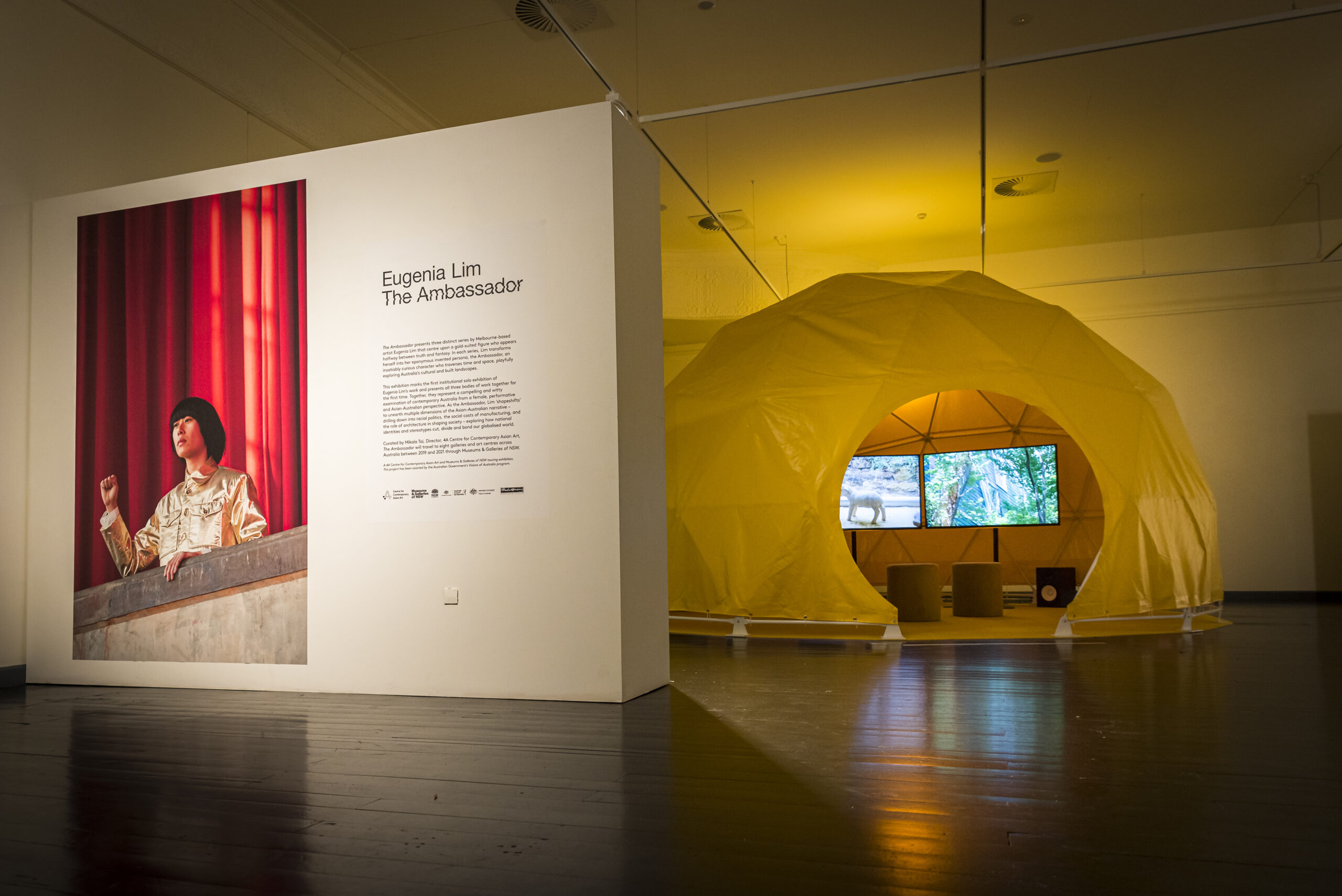
Eugenia Lim: The Ambassador, installation view, Riddoch Art Gallery, Mount Gambier, 2020. Photo by Tim Rosenthal.

Zanny Begg | These Stories Will Be Different exhibition installation view, The Condensery. Image: Jim Filmer

Anna Louise Richardson, The Good, installation view at The Condensery, QLD, 2023. Photo by Jim Filmer.

Introductory panel to Void at Bathurst Regional Art Gallery.
Image: Vanessa Low, Musuems & Galleries of NSW.
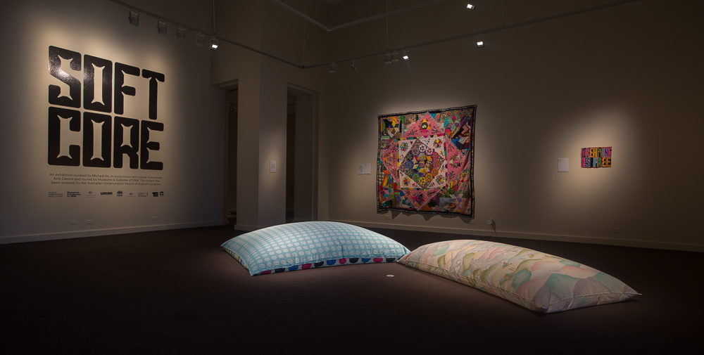
Soft Core exhibition on display at Perc Tucker Regional Gallery.
Introductory panel and individual artwork labels can be seen in this view. Image: Perc Tucker Regional Gallery.
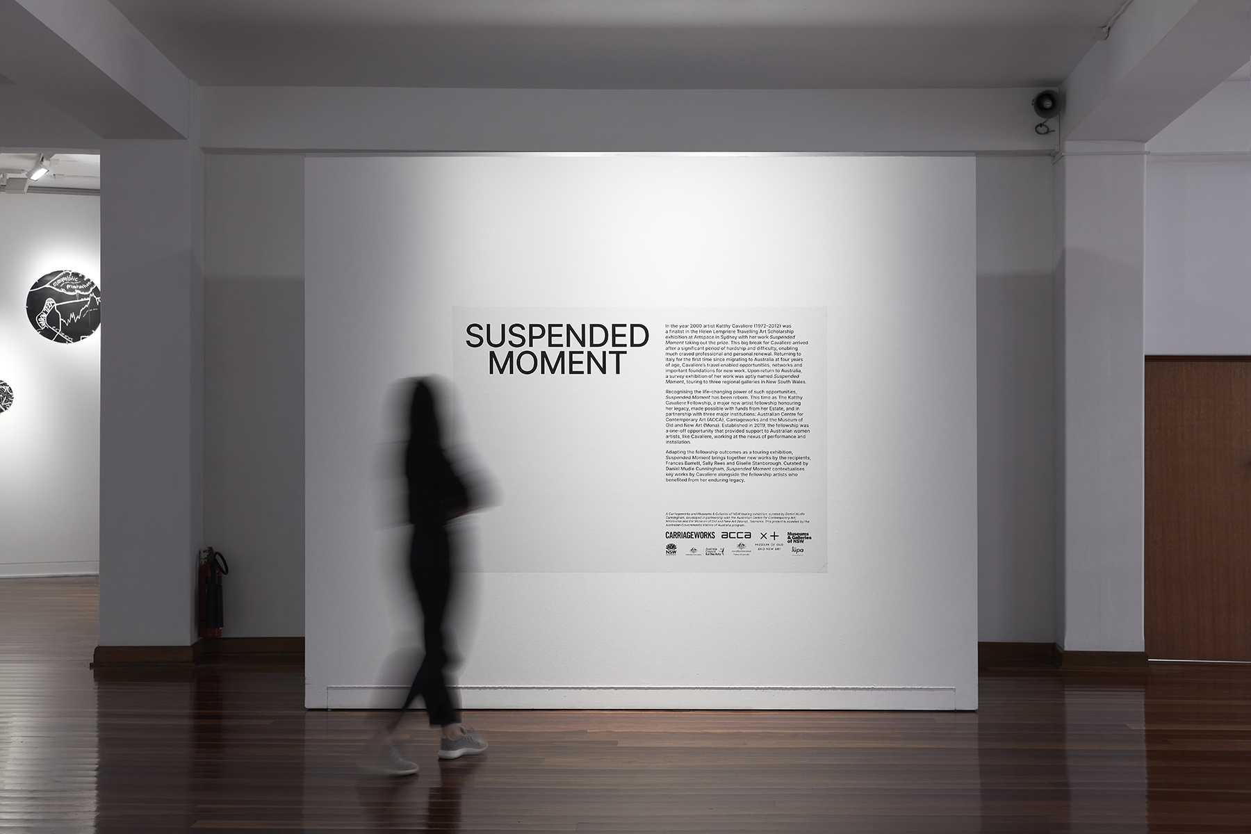
Suspended Moment exhibition, installation view of the intro panel, Wollongong Art Gallery. Image: Zan Wimberley
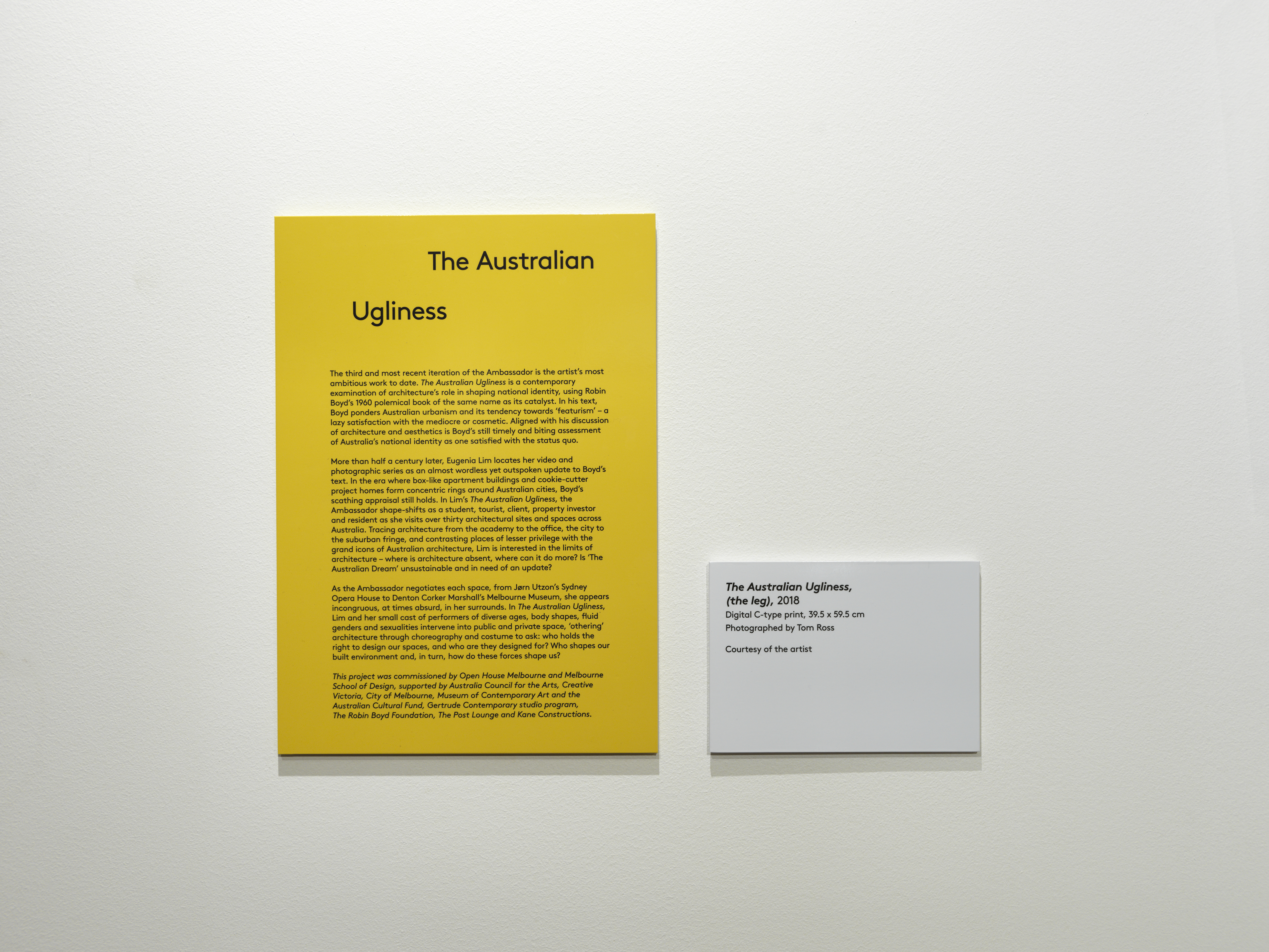
Exhibition labels from Eugenia Lim: The Ambassador.
Information panel and individual artwork label. Image: Sharpshooting, courtesy Nautilus Art Centre, Port Lincoln
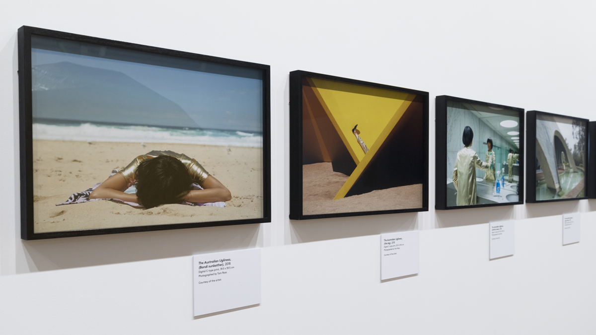
Examples of citations from Eugenia Lim: The Ambassador exhibition installation view at Goulburn Regional Gallery. Photo Silversalt Photography.
Not sure what to write on your labels? Here are a few things to consider.
Basic information structure
- Artist / maker
- Title
- Date
- Medium/materials
- Dimensions
- Provenance or collection
- Description
How much information?
Your label will be read by people without any prior information and by those who are well versed on the subject, so choose language that is clear, concise, integral and avoids jargon.
Select information that provides contextual significance about the object and its place in the exhibition.
Keep the order of information consistent and include key things of interest about the artwork to give important story line information.
Be aware of audience fatigue and use a 70-80 word count on individual artwork labels and 100-200 words for introductory panels.
A standing read time of 10 seconds is also the average time given by audiences to any one label, so once you have written it, test it to know the most important information is included.
Label hierarchy
For large scale exhibitions with an overarching narrative a label hierarchy is useful to break up information into digestible sections.
An example might look like this: An introductory panel to the exhibition – themed labels for each room – individual artwork labels.
Visual cues or symbols help connect sub-themes and provide quick identification of other sources of information such as for audio guides or children’s labels.
Consistency of font, text size, spacing and type assists audiences in digesting information. Studies suggest that certain fonts such as Helvetica Regular, Verdana and Arial in a size of least 18 points are the easiest for the eye to comprehend for text based information. Text sizes should be increased if audiences are standing further than 1 metre from labels.
Label types and materials
The most basic form of label is printed information on adhesive paper mounted on card or foam board. This can be done in house and cut to sizes as needed.
Laminated or vinyl printed labels can be sourced through external printing companies. These offer flexibility for specific size requirements, large batch printing, and present better graphic qualities for printed information. These may be single use as vinyl stickers or made more durable for long term use as printed photo paper with laminate mounted on boards such as Forex.
Black text on white, cream or clear background is best for legibility however it’s good to reassess this if the wall colour or lighting may be different for a particular exhibition design.
Labels should aim not to dominate over the objects they are placed alongside.
For other signage including the masthead, exhibition title signage, and large introductory panels, capture the audience’s attention by using large print vinyls which offer good visual qualities.
Audience
Knowing which audience groups your labels may not communicate effectively with is very important.
The following visitors might benefit from varied labelling, a labelling hierarchy or visual cues and symbols:
- Children and families – use labels containing active prompts to encourage looking and responding to the displayed objects or artwork. Place these labels at a lowered height line and include symbols to create a way of leading the audience through the exhibition.
- Groups with accessibility issues – provide large print text on portable information sheets for elderly, visually impaired or less mobile audiences. Place these at centralised seating points with increased lighting which reduces the need to stand for long periods of time in front of artworks.
- Varied language groups – Dual labels which include basic information in two languages can open access to audiences identified as a strong group for an exhibition. Pay attention to the quality of translation and use professional interpreters where possible. Alternatively, provide foreign language audio guides, interpreted room sheets or tailored tours with an exhibition guide.
- In situ technology – video material, audio recordings or interactive devices such as ipads or touch screen monitors makes it easy for audiences to choose how they prefer to engage with exhibition information.
Placement and location
The layout and placement of labels in relation to a logical walking path is also very important. The flow of information should build a narrative or develop a learning experience for the audience.
Research suggests that audiences will turn left unless directed to do otherwise. Keep in mind and ensure that labels are placed on the side of the artwork which will be approached first.
Place labels between eye-level at 150cm to a lower height of 1m and within close proximity to the artwork they reference. Adhere small mounted labels with Bluetac or similar easy to remove product.
Double-sided Velcro tape will support heavier labels however this can mark walls when removed.
Ensure the label level and placement is consistent across the exhibition and that audiences are not required to bend or adjust their posture to read.
Gallery tools such as seating, temporary walls and lighting can also assist in affirming a direction for the audience or breaking up a space if needed.
Technology
Technology increasingly provides new ways to communicate exhibition information. Many people have been shown to retain information better when they use a combination of senses and learning approaches.
Think about providing related video material such as interviews or documentaries which screen in situ in the exhibition space. Audio guides or interactive devices such as touch screen monitors or ipads, which allows the audience to select information according to personal preferences, can provide enriching narratives.
When incorporating these forms of technology consider the impact of sound and light bleed. Didactic technology should not dominate over the artworks they reference.
The online presence of information and links to resources is often the first and last point of reference for gallery visitors prior and post visit.
Interactive prompts such as QR codes may help in making a connection between the immediate exhibition and online content, however these should not take precedence over other standard forms of label information.
You might also like:
Museums & Galleries of NSW
Basics of touring an exhibition
The J Paul Getty Museum
Complete Guide to Adult Audience Interpretive Materials: Gallery Texts and Graphics
Australian Museum, Sydney
Writing Text and Labels
